Fresh Energy — iOS, Android, Web UI Design, UX Design, Communication Design
Providing insights into electricity consumption and opening opportunities in a new, growing market.
Fresh Energy builds customer-centric products based on smart meter data, with a focus on helping users understand their energy consumption. Based in Berlin, they’ve raised over €6m since 2017.
The challenge
Taking over an existing project and redesigning UX and UI without alienating existing users. Adding features aligned with business goals and creating solutions supporting business models — for instance, the product had to be designed in a way that allowed white-labeling. I was requested to come up with new branding as well.
My process
Working closely with product and business teams aligned me with their goals. We invited users for in-house testing to identify user goals and define a feature roadmap. A private Facebook group was opened for our users — with weekly surveys on features they would like to see and problems they were experiencing. I facilitated design sprints to bring new features to life. By deep-diving into company values in multiple sessions with the management I kicked off a complete brand redesign.
Results
I started by decreasing the Customer Acquisition Cost and redesigning the information architecture of all apps — having in mind the white-labeling requirements — while ideating features aligned with business and user goals. Following a rebrand, a new visual style was applied.
CAC was reduced by -20% and 4 new white-label partners signed up. 3/10 most requested features (by public vote) were rolled out.
Information Architecture
Tab bar navigation replaced the old side-menu navigation. Based on user interviews, new sections — profile and household information — were added to their expected places. To support future business goals, a services section was added as well.
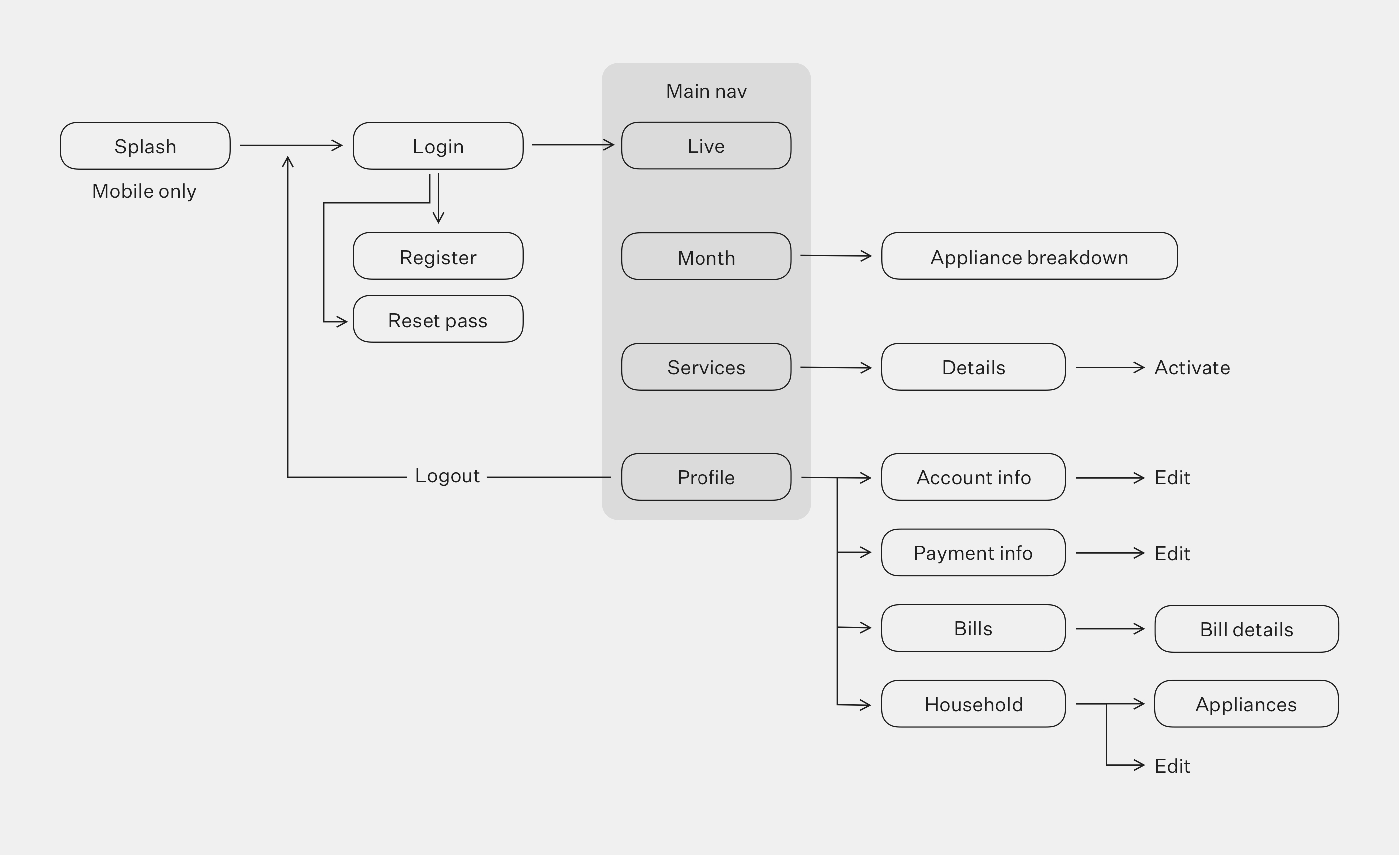
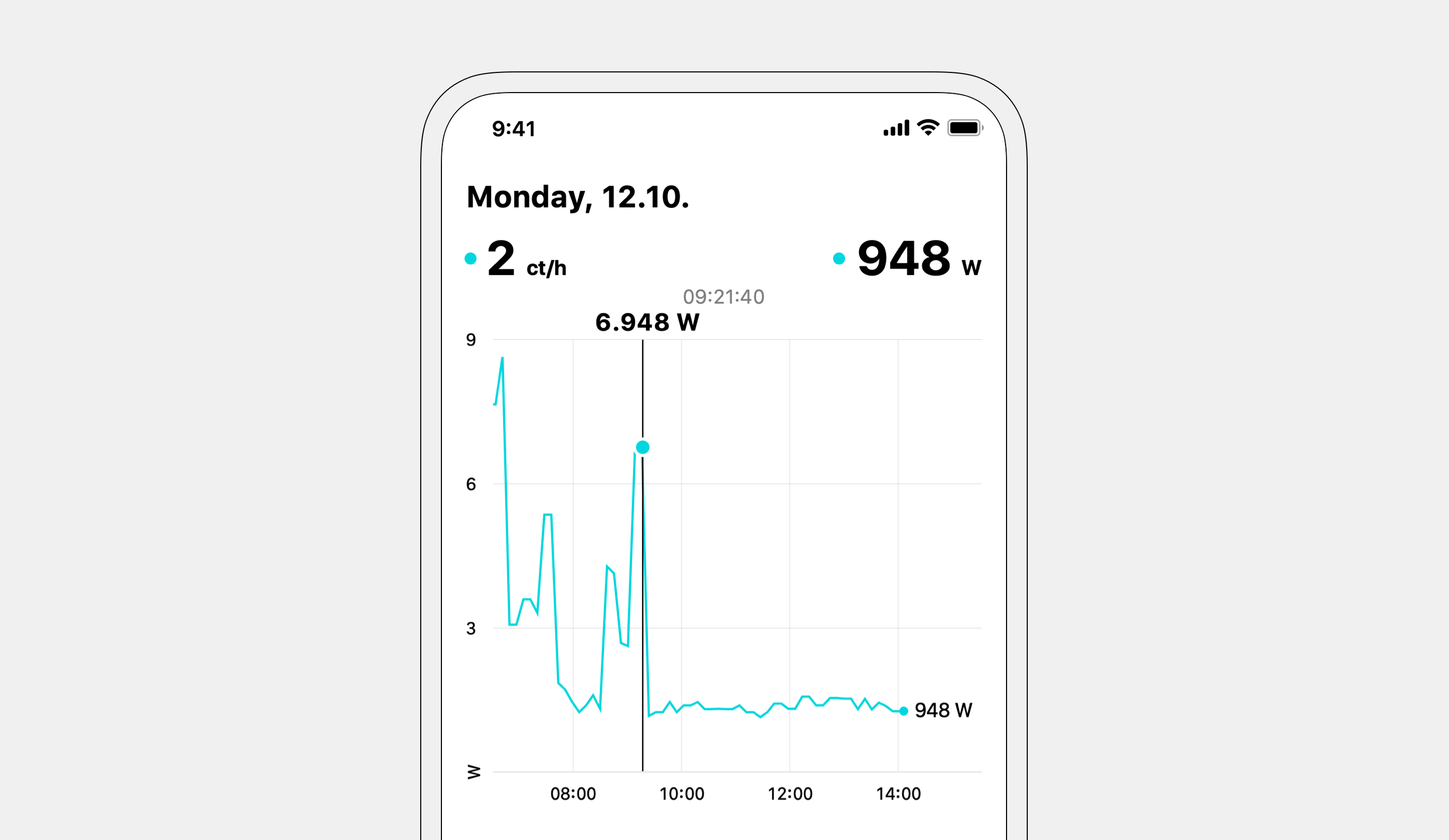
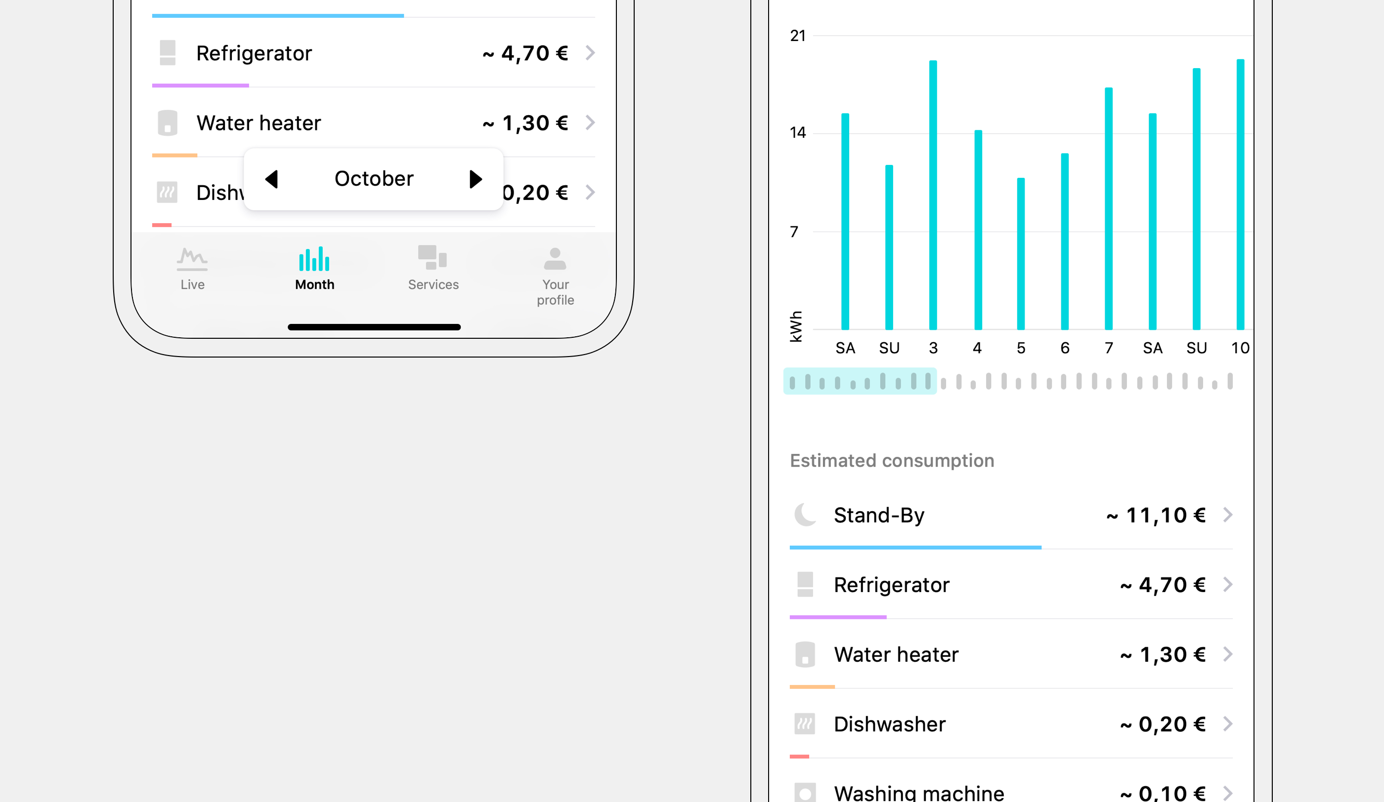
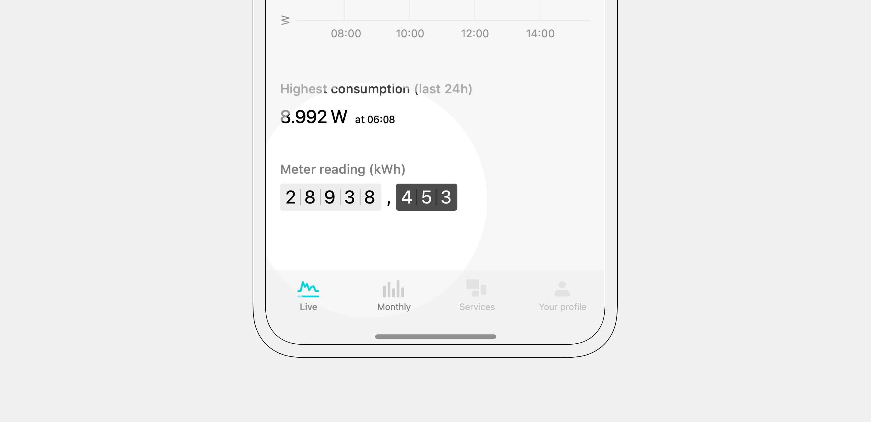
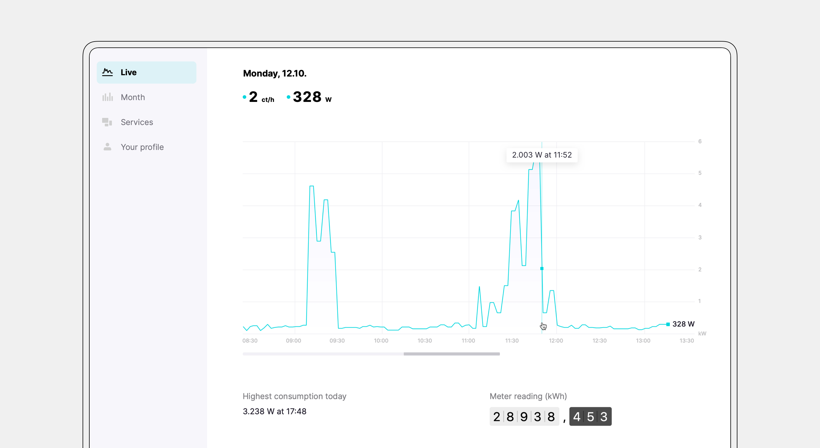
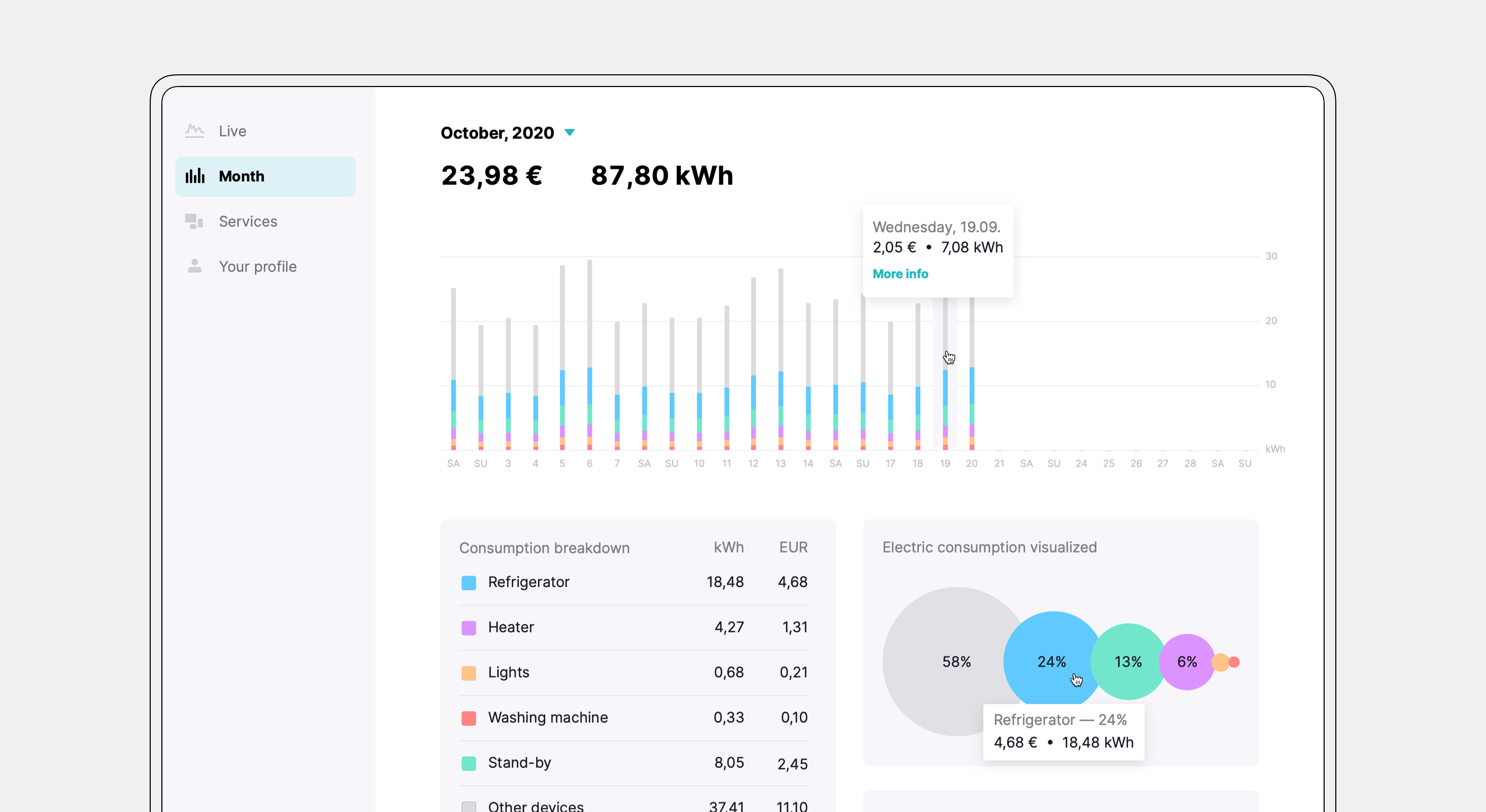
Main use cases — checking live and historic electricity consumption — were simplified and enriched with additional ways of displaying existing data. The real-time cost was added for the live view, while daily consumption was added for the historic overview.
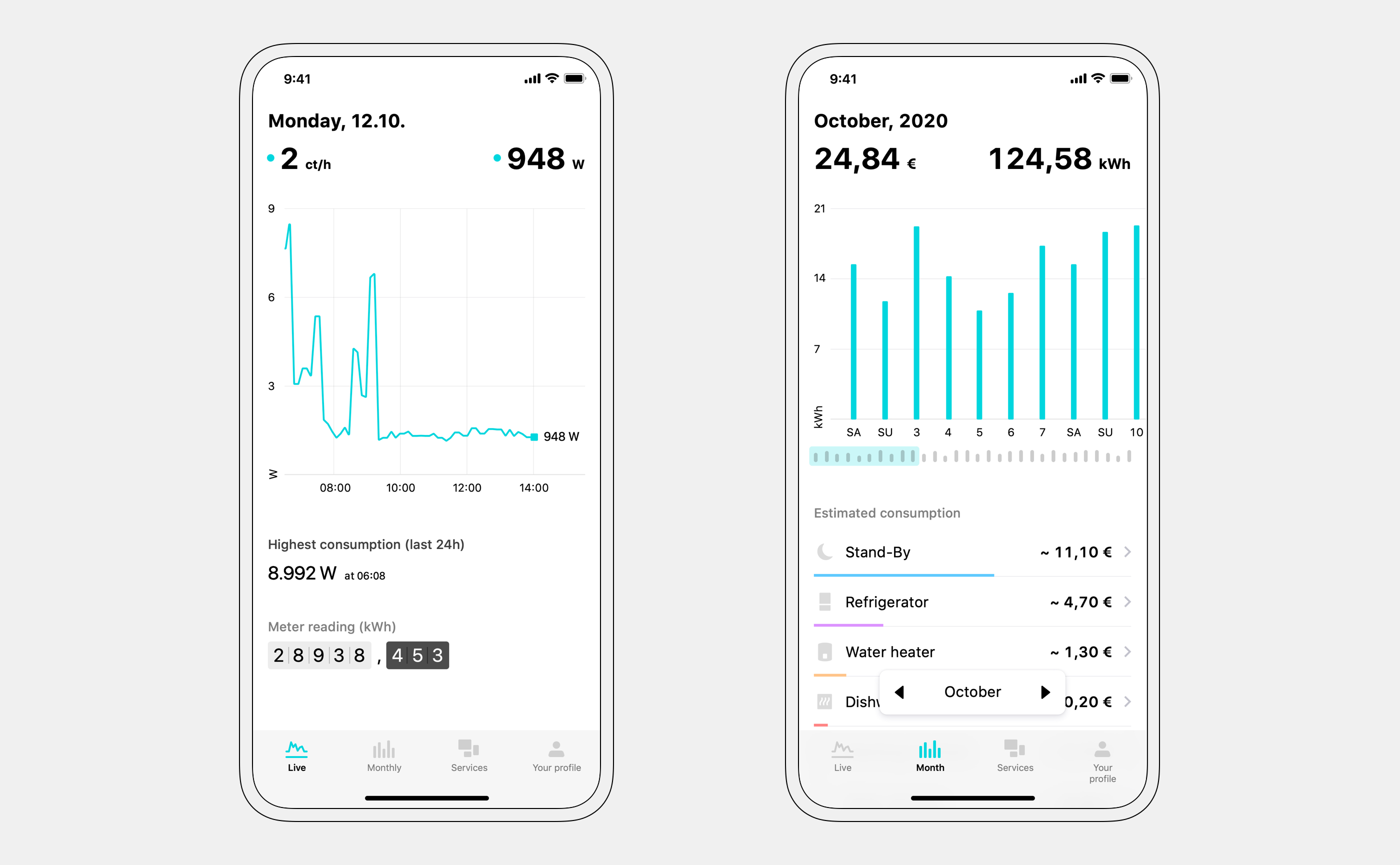
Up to 2-second resolution for consumption data is available.
Month navigation was moved to the bottom to improve usability. Specific appliances are disaggregated in the app — color-coded bars communicate relative consumption between detected appliances.
A live meter readout was implemented as well — this meant that Fresh Energy users can check their meter status without a trip to the basement.
Reducing cost to serve
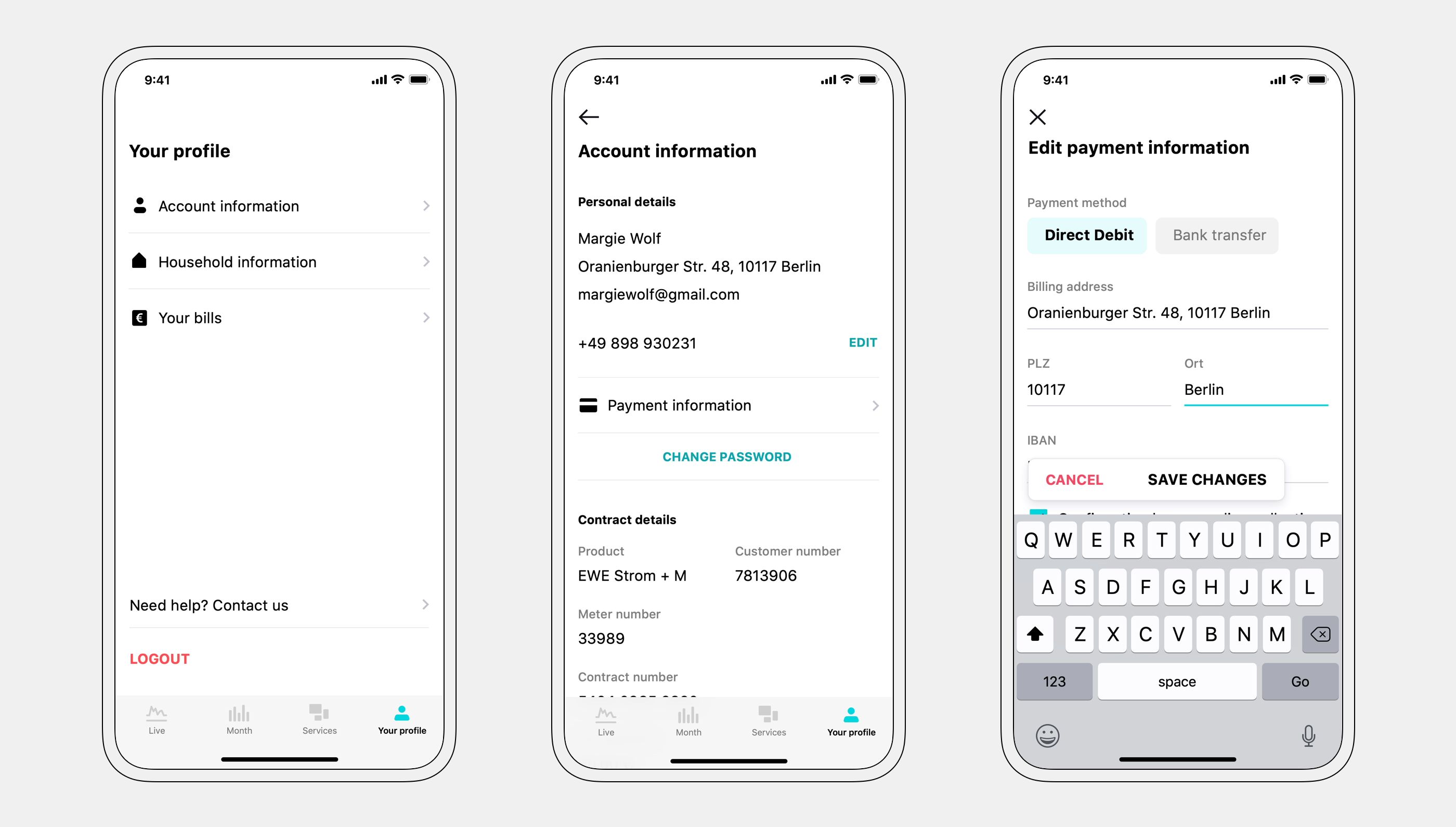
To change their data, users had to call customer support — there was no edit functionality in the app. The weekly average was 6 support calls per 1000 users. I added all the information we had on our users to the profile section and made them editable.
Meeting business and user goals
Using the data we already had and working with the product and business teams, I was able to ideate new, innovative services. By using only existing data, we saved precious development time and reduced time to market.
Designing new services
Before building a new service, we assessed its viability with a simple pilot project. Pilot projects were done through email communication and manual work. After confirming the demand, we went ahead with the actual implementation in the product. The design was tested during and after both UX & UI phases.
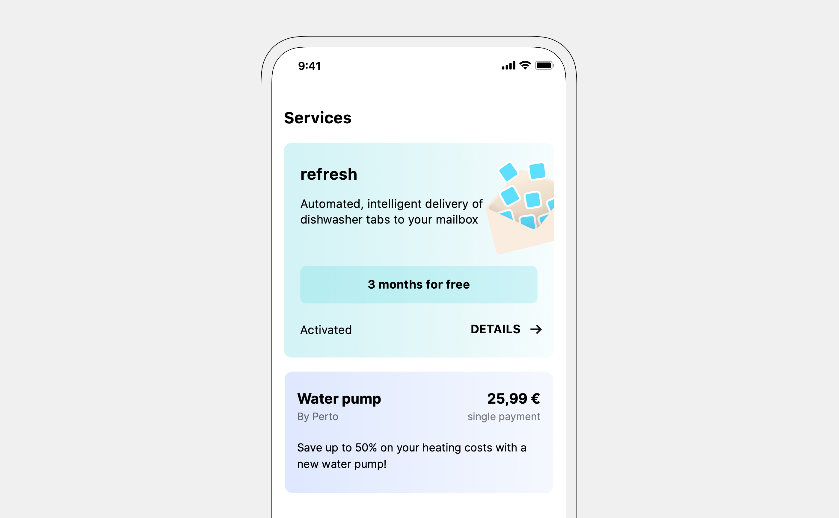
Refresh — service 1
“Refresh” is a subscription service, based on existing data. An algorithm detects how many times our users use their dishwasher. A package of dishwasher tabs is sent out so it arrives exactly when they run out — giving our users a magical experience.
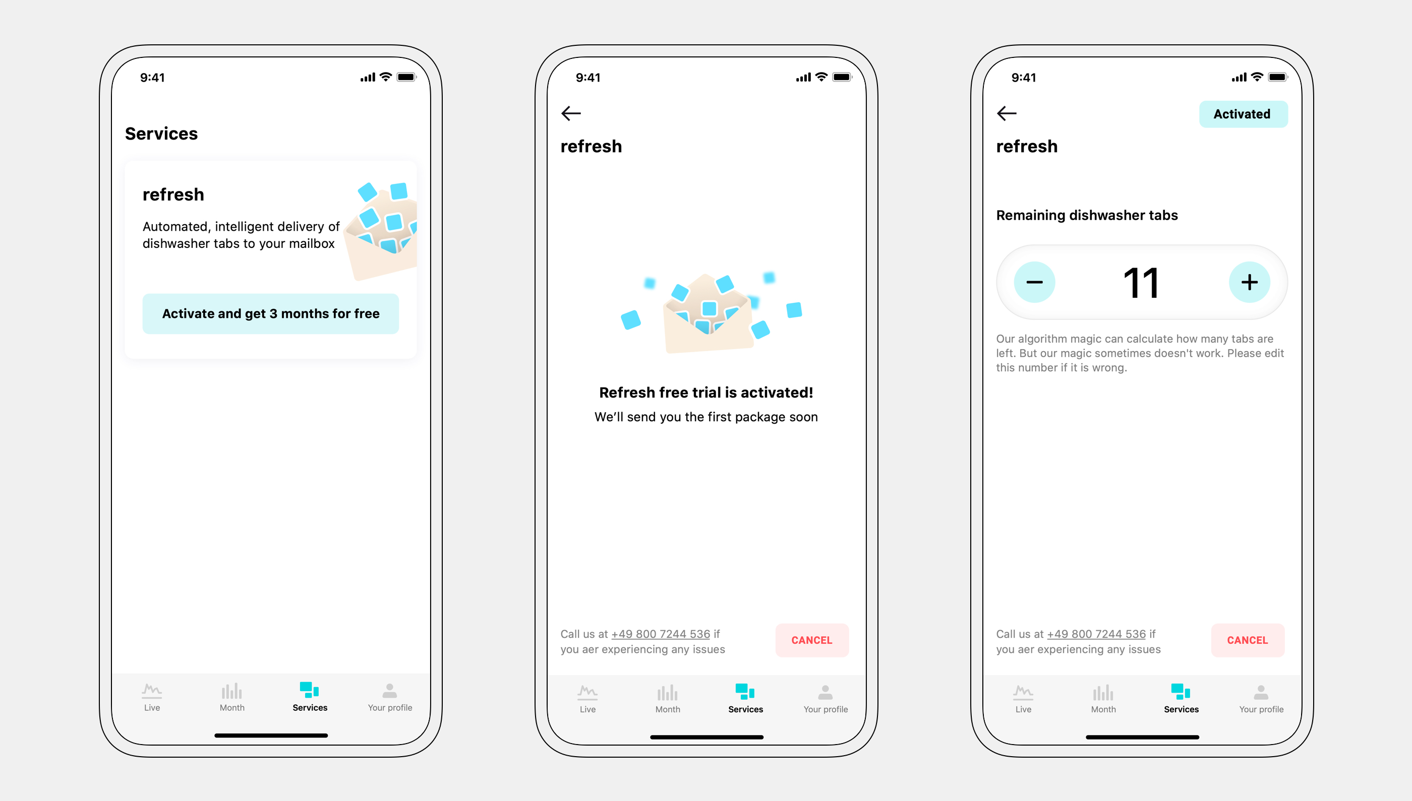
A free trial was offered to increase adoption.
Fridge recommendation — service 2
Through research and pilot projects, we found out that most of our users had no idea if their fridge spending was below or above the average for a given fridge size. The app analyzes our users' fridge consumption and compares it to our database. Based on the comparison, we calculate potential monthly savings — together with the amortization time for a new fridge.
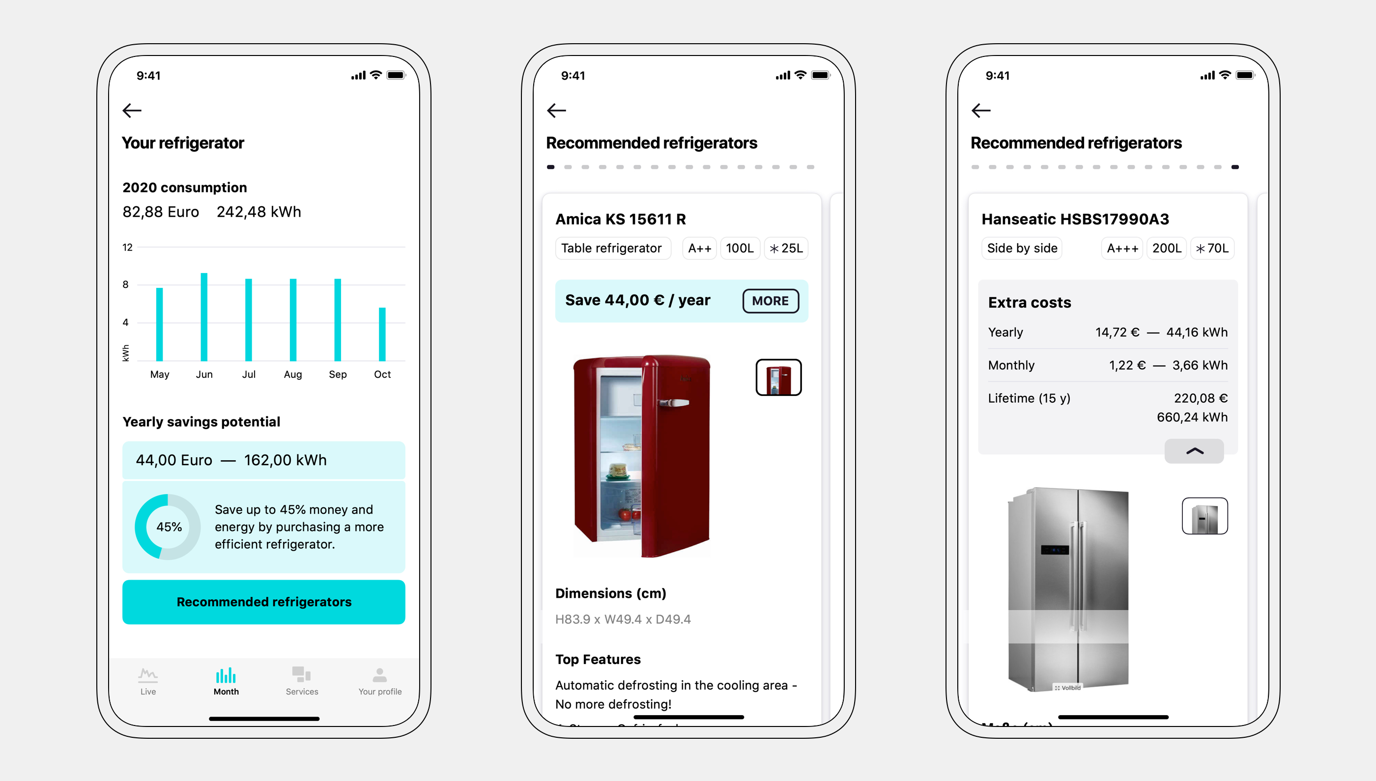
I facilitated a short 3-day design to define and quickly prototype this feature. We found out that our users primarily wanted to upgrade to a bigger fridge — this impacted the final design. Fridges that cost more were added to the comparison as well.
Consistent experience
The web version was designed with the same basic functionality — but expanded with more information due to more screen real-estate.
A graphical way of displaying electric consumption was added to the desktop version.
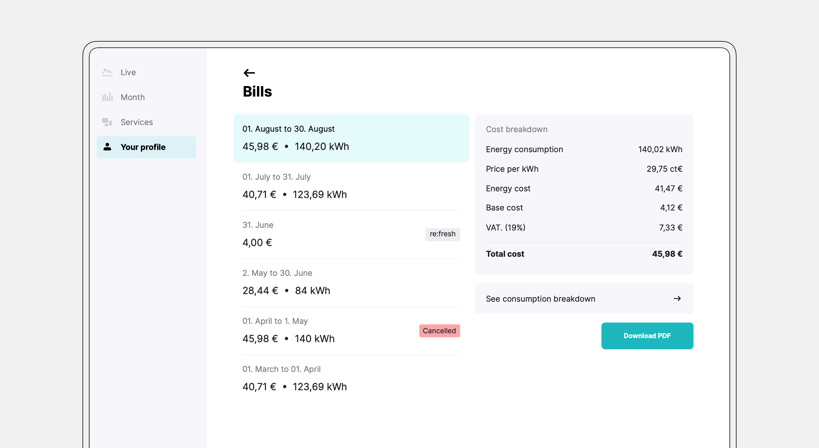
For bills, a quick overview of the most important information is shown on the same screen.
Design system — compatible with white-labeling
The UI was designed to allow partners to adapt it to their branding. Colors and font sizes are used sparingly.
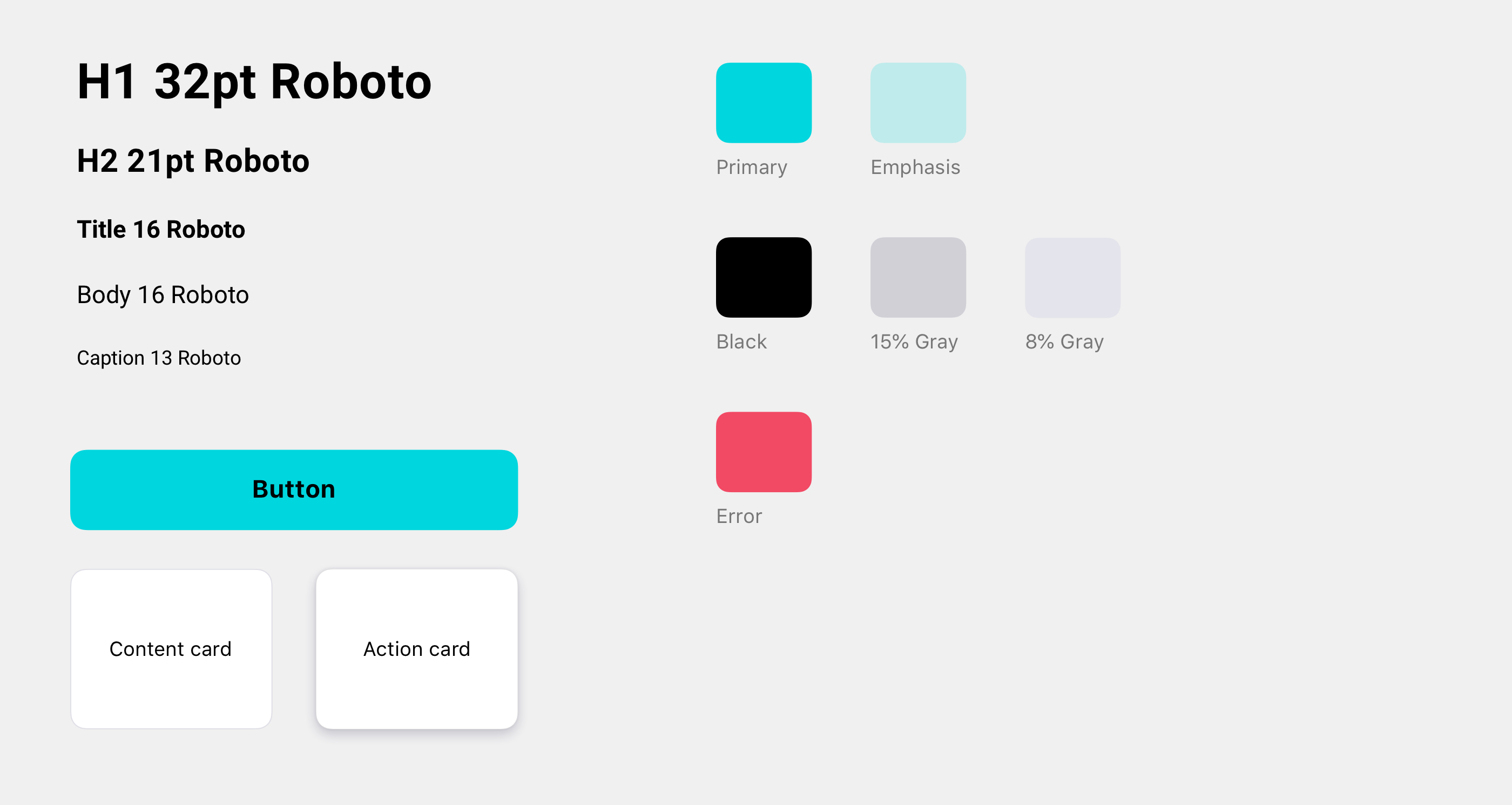
Rebrand
A new logo was brought to life — together with company goals and values. It plays off the combination of letters F and E — representing transformer coils — transforming our users' experience with electricity.
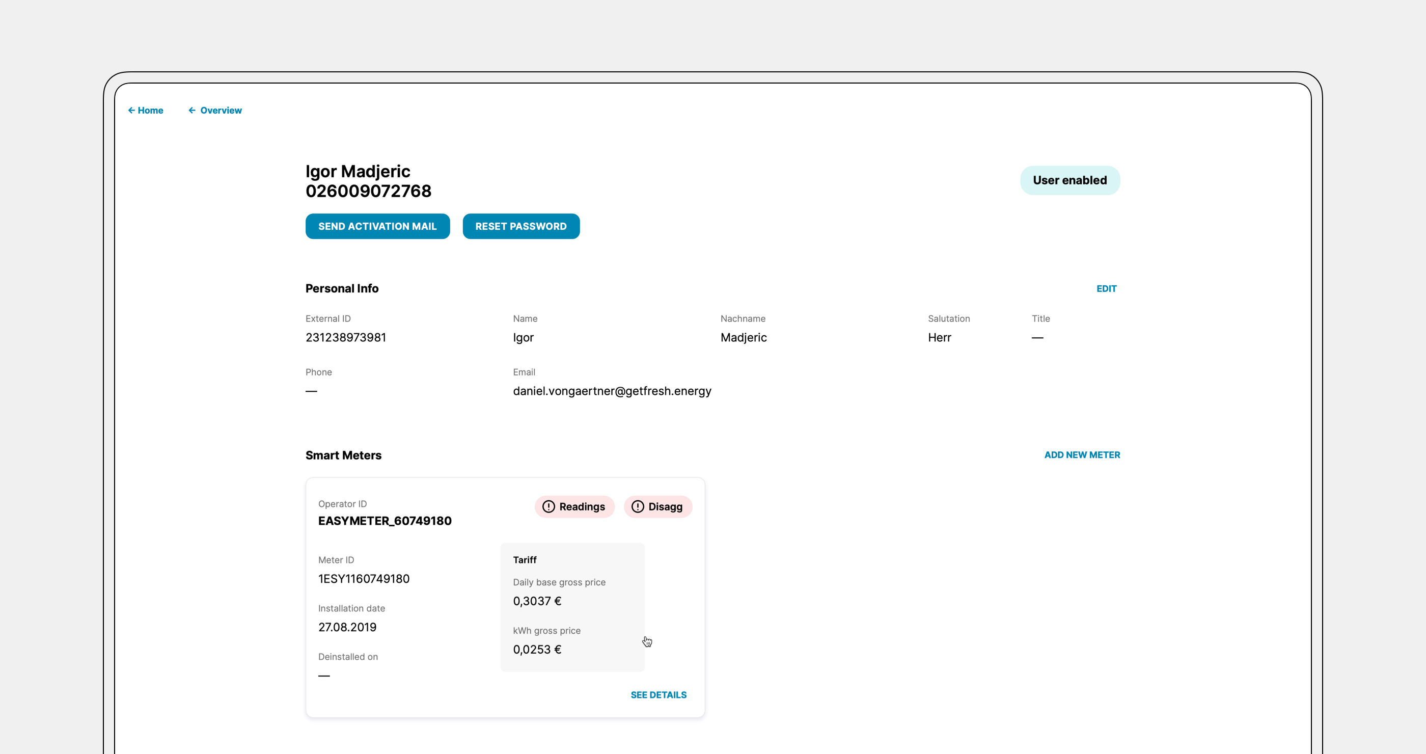
Supporting our business partners
Since part of our business model was white-labeling our product, I designed an admin dashboard. All users and smart meters are visible on the dashboard. Admins can quickly create, delete, and connect meters to users.
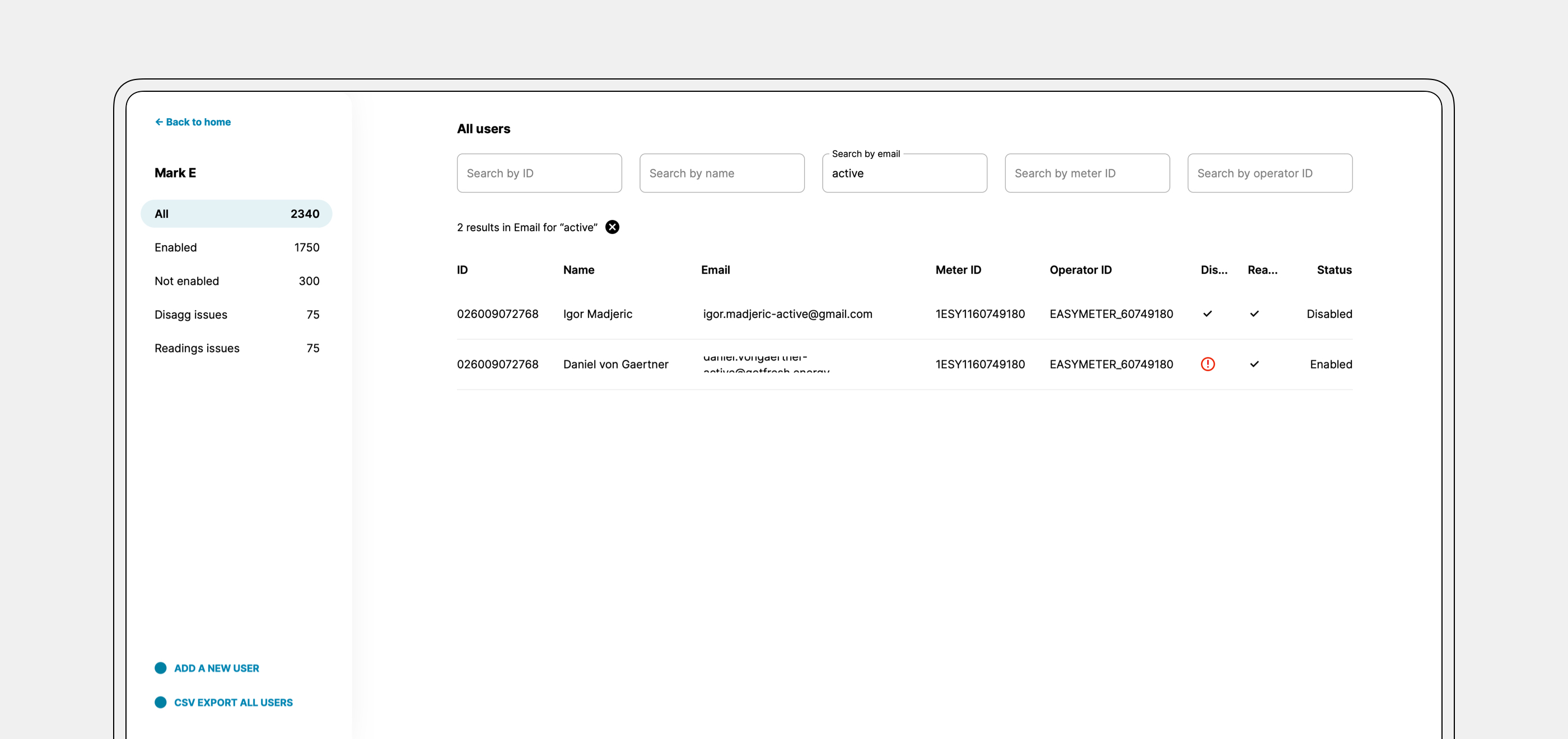
Issues with either users or meters are communicated clearly so the support department can act quickly.
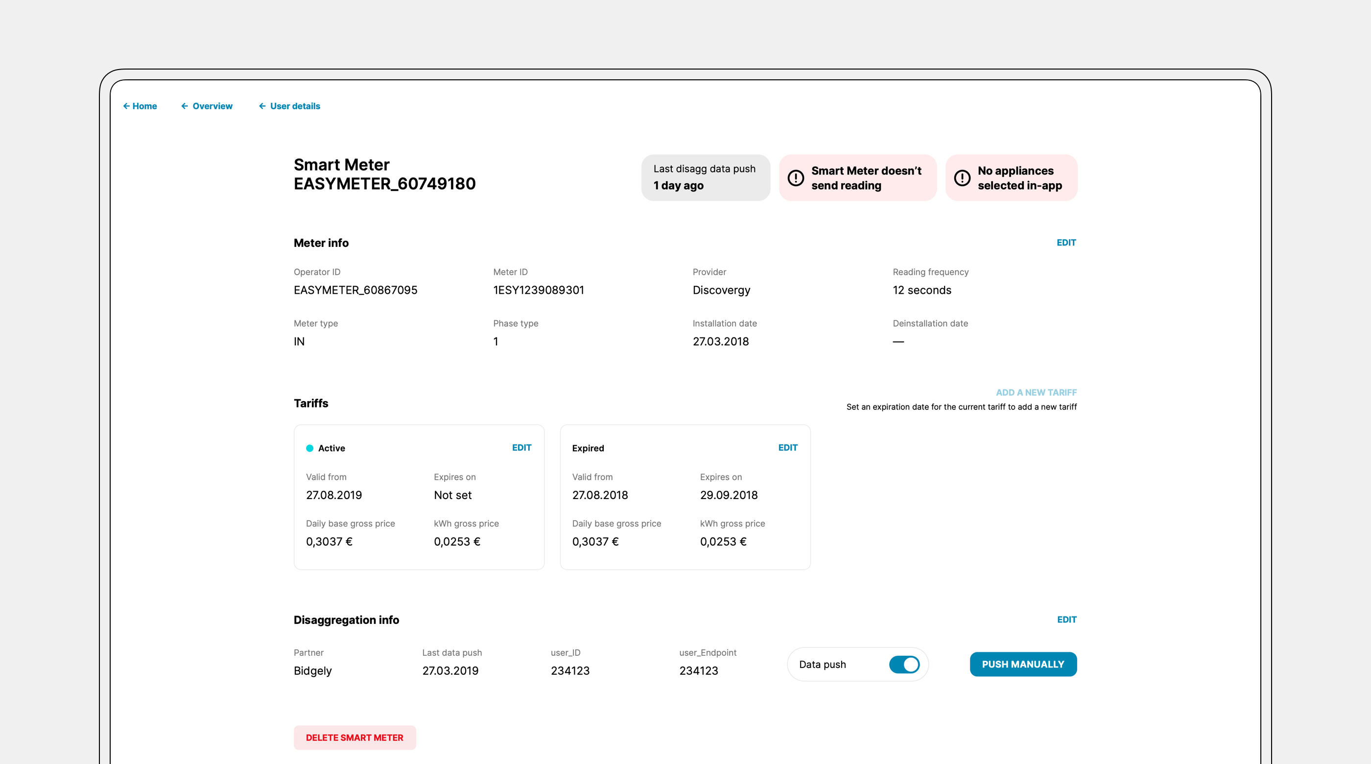
The dashboard was a great selling point since most of our business customers didn't have a similar solution for their userbase.
— thank you